AVEN
Brand Identity design
Packaging Design
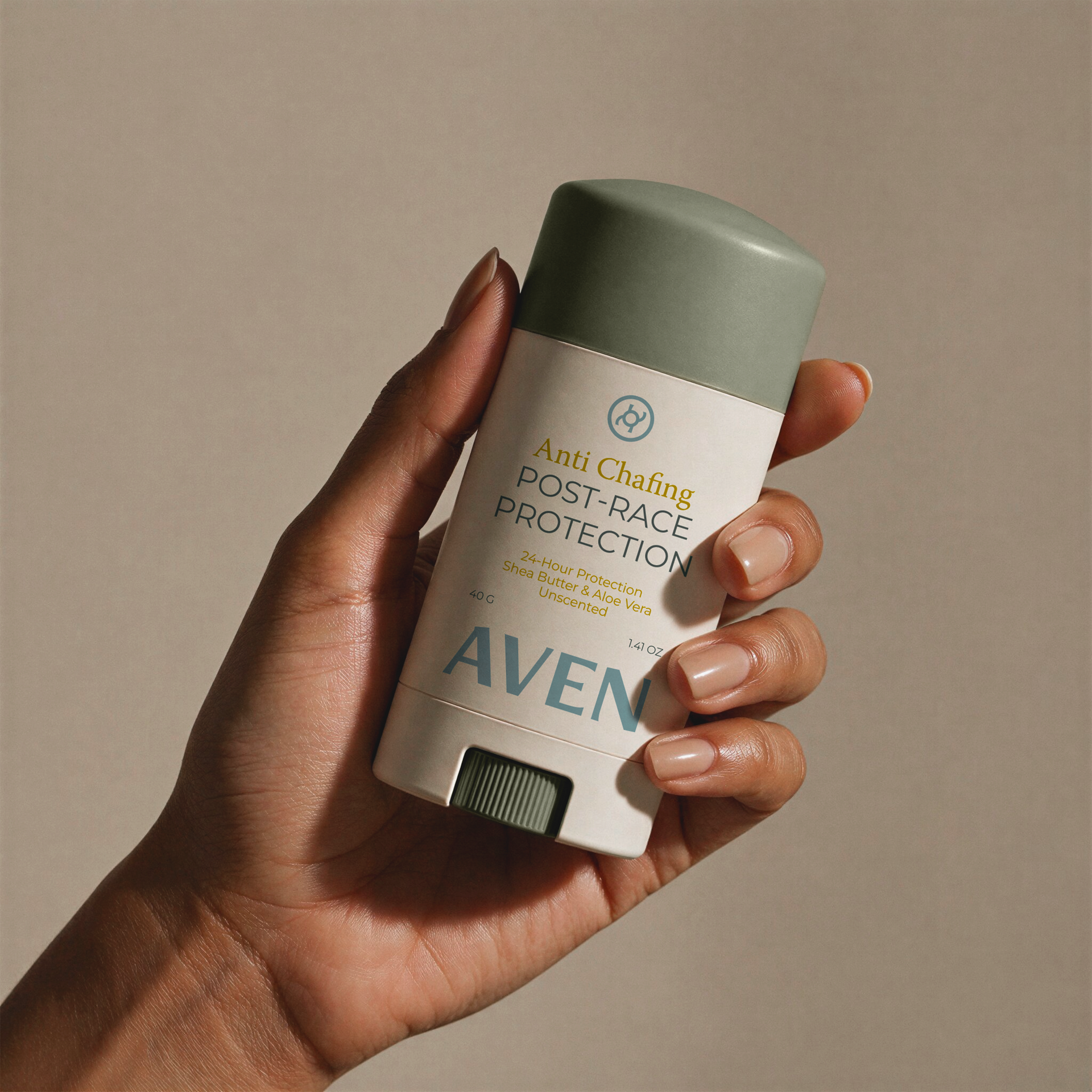
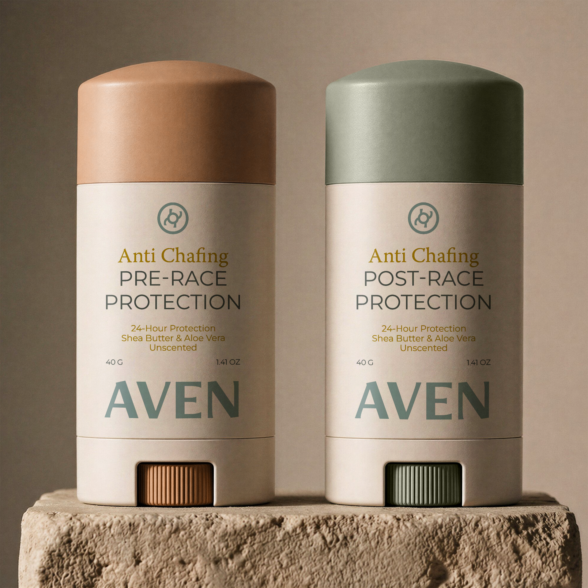
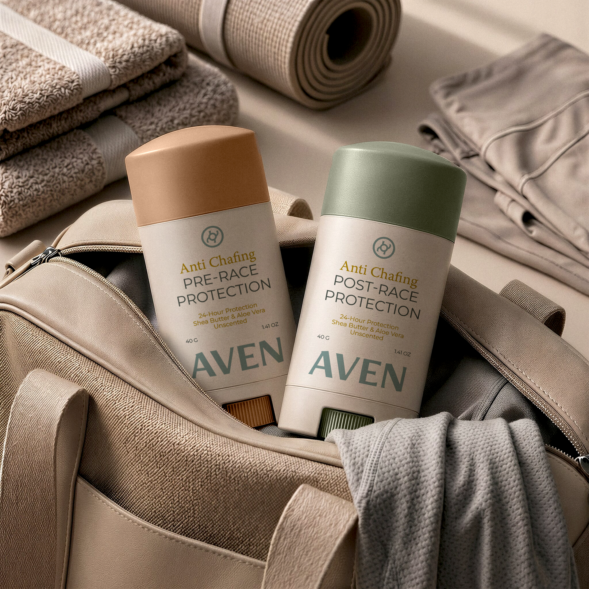
AVEN is a conceptual anti-chafing stick created for athletes who approach preparation with the same discipline as performance. Developed as an unscented, moisture-rich balm with shea butter and aloe vera, the product was designed to position skin protection as an essential part of every training session and race-day ritual, just as important as shoes, hydration, or a bib number.
The project explores how functional sportscare can be redefined through a more elevated and contemporary lens. Rather than relying on clinical packaging or high-intensity sports tropes, AVEN introduces a refined, gender-neutral identity that feels modern, premium, and universally relevant. A muted palette of warm neutrals and soft earth tones balances luxury with accessibility, while understated typography communicates quiet strength, confidence, and composure.
At the center of the identity is a custom symbol inspired by movement, rhythm, and momentum, a subtle nod to the cadence of running and the flow of motion. This mark expands into a wider icon system created for running, swimming, and cycling, allowing the brand to communicate across disciplines while reinforcing a cohesive visual language rooted in versatility and performance. Together, these symbols form a flexible brand system that can extend across packaging, campaigns, digital touchpoints, and future product categories.
Across the wider brand world, imagery and materials emphasize smoothness, calm, and readiness, reflecting the product’s promise of comfort. Every touchpoint was designed to make protection feel intuitive, desirable, and seamlessly integrated into an athlete’s routine. The result is a concept that brings elegance to endurance, performance care designed not only to function, but to belong naturally within the rituals of modern movement.