Brand Identity design
Packaging Design
About this Project
AVEN is as essential as a runner’s shoes and bib, a reminder to never skip protection in a race routine.


Portraits of people from around the globe
Button

AVEN brings elegance to endurance. Functional, beautiful, and always race-day ready.
The logo mark captures movement and momentum, a nod to the rhythm of running. The classic and timeless cap colors excude luxury. The typography is understated yet strong, mirroring the confidence of the athletes who use it.


Portraits of people from around the globe
Button

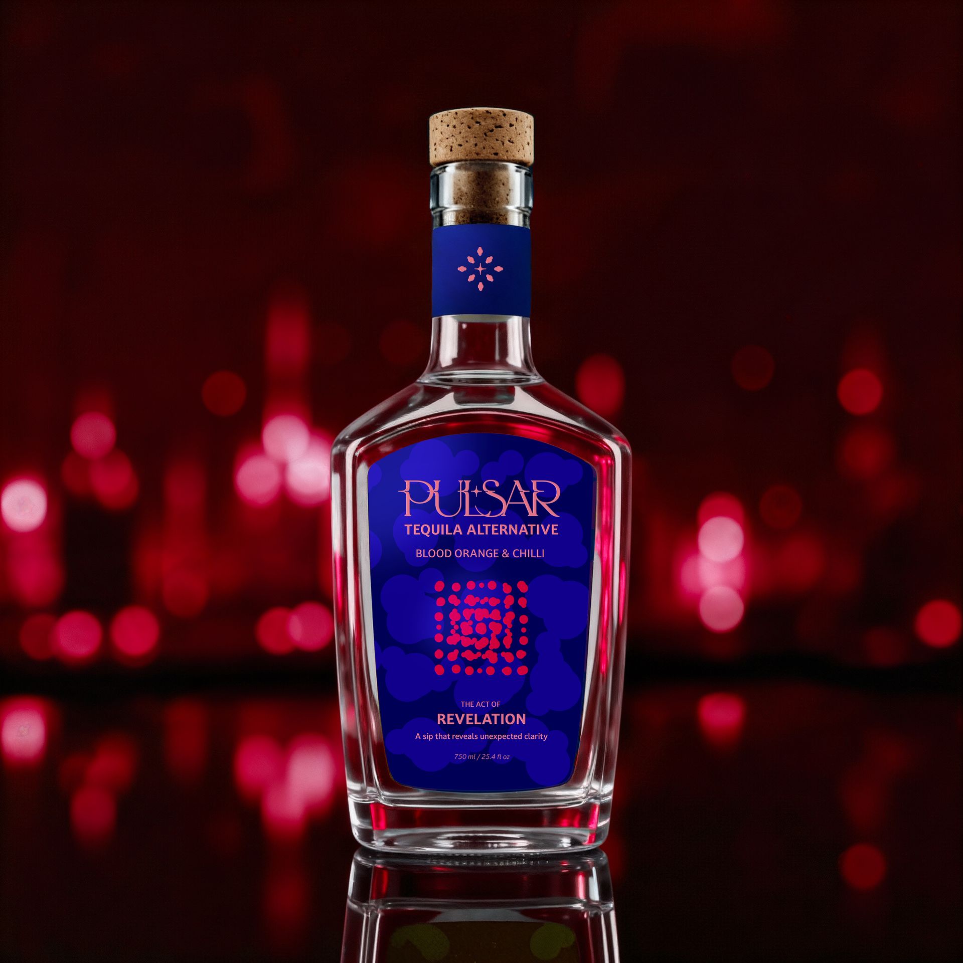
At its heart lies The Six Acts — Presence, Unveiling, Living, Spark, Awakening, and Revelation — each representing a distinct state of being. Every initial in PULSAR was custom-crafted to embody its act through subtle rhythm and form, creating a typographic constellation that reflects the brand’s ongoing journey of discovery.
Visually, the identity moves through a galactic color spectrum, six bottles shifting from green to cyan, magenta, and deep red symbolizing emotional and spiritual progression. The system pairs luminous color with calm precision: clean typography, open composition, and minimal detail that allows the story to breathe.
Pulsar is a meditation on connection, curiosity, and light. It is a quiet ritual that reminds us that the journey itself is the destination.
Got questions? I've got answers and I'm excited to hear from you.
Drop me an email at: noor@noaddesign.com While you’re here, feel free to browse the Services Guide to learn on the ways we can collaborate.
RELATED PROJECTS